Create Your First Project
Start adding your projects to your portfolio. Click on "Manage Projects" to get started
Red
Soort project
Art direction Red magazine
Datum
2004 - 2008
Locatie
Amsterdam
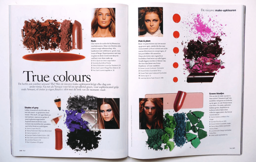
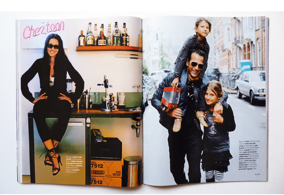
For the Dutch edition of the British lifestyle magazine RED, I developed a visual direction that was completely different from the English edition. Only the logo was required to be the same as the original.
Typography, layout, flow, and visual language: the entire concept and look of the magazine were designed for the Dutch market. I developed photography concepts for fashion, beauty, portraits, and editorial sections, and supervised the execution by photographers, stylists, and designers with a keen eye for atmosphere and detail.
The cover policy was given a clear signature—image, atmosphere, styling, and composition in line with the tone of the magazine. RED was given a Dutch look, created for a Dutch reader—not translated, but redeveloped.


